Transforming a fragmented, time-consuming workflow into an intuitive, AI-augmented experience

Overview
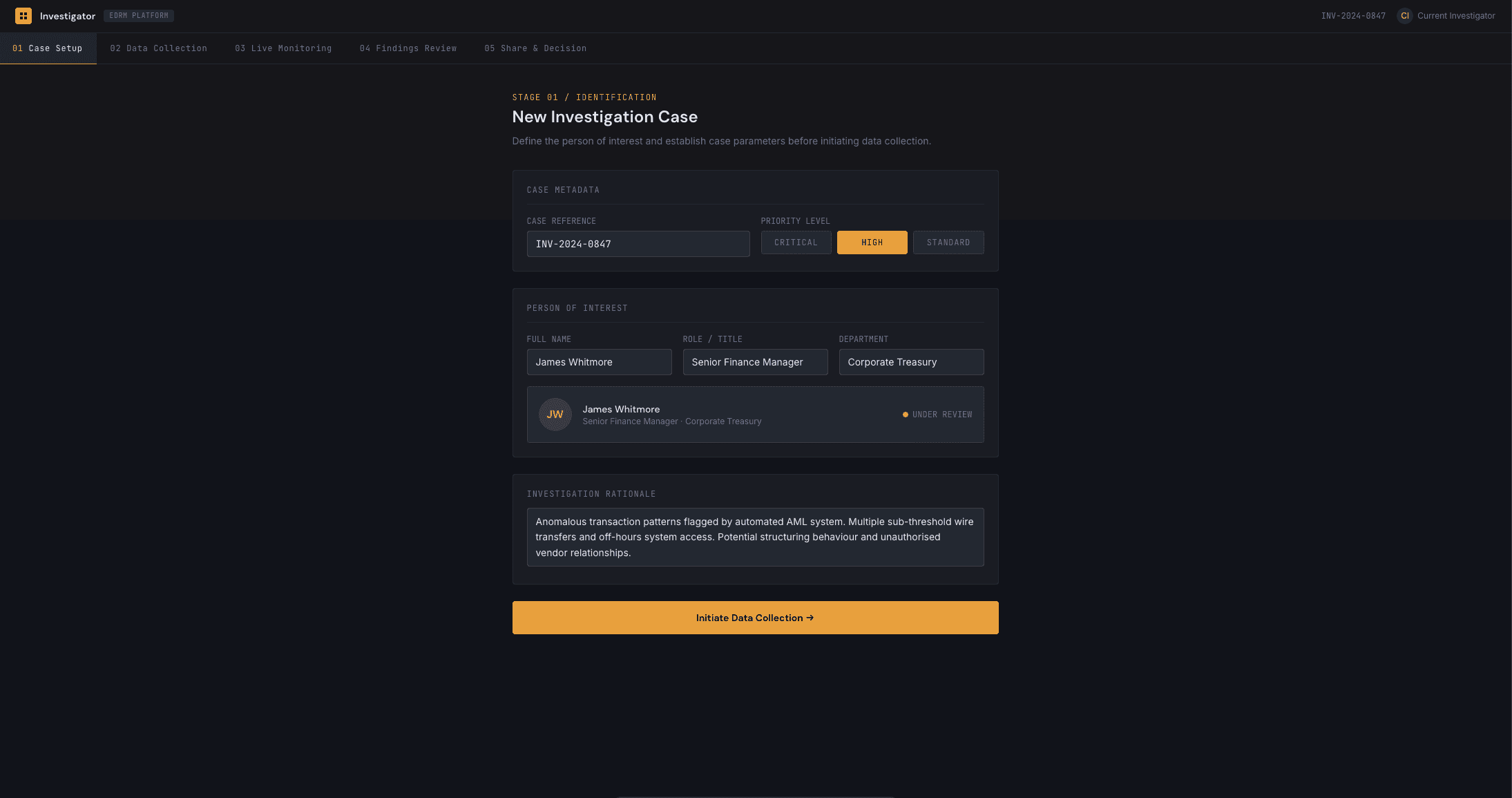
At Nuix, data sourcing — the process of identifying, collecting, and preparing data for investigation within the EDRM (Electronic Discovery Reference Model) framework — was fragmented, dated, and cognitively demanding for users. What should have been a streamlined starting point for the entire investigative workflow had instead become a bottleneck, with a poorly laid out interface, hidden functionality, and a lack of clarity at nearly every step.
As the volume and complexity of data sources continued to grow, the urgency to modernise this workflow became a business priority — not just to improve usability, but to reduce the time and cognitive load required to get investigators from "start" to "collected data" as efficiently as possible.
I led the end-to-end design of this initiative — from current-state analysis through to a validated MVP — balancing quick, deployable wins with a longer-term, AI-augmented product vision.
The Problem
The existing data-sourcing experience suffered from several compounding issues:
Fragmented workflows — data collection spanned multiple disconnected steps with no clear through-line
Outdated, cluttered UI — poor visual hierarchy buried key actions and information
High cognitive load — users had to hold too much context in their heads with little system support
Missing UX fundamentals — no confirmation dialogs, no clear error handling, no summary of selections before execution
Rigid data selection — date and source selection lacked flexibility, offering no relative date options or granular filtering
No visibility into progress — users had no indication of where they were in a multi-step process.
These gaps didn't just frustrate users — they slowed down time-critical investigative work and increased the risk of user error.
Small font sizes, poor visual hierarchy and cluttered layout increased cognitive load – creating friction throughout the data collection process for users.
My Approach
I structured the initiative in three parallel tracks: quick wins, validated MVP design, and aspirational AI-driven vision — ensuring the business saw continuous improvement while a bigger transformation was validated in the background.
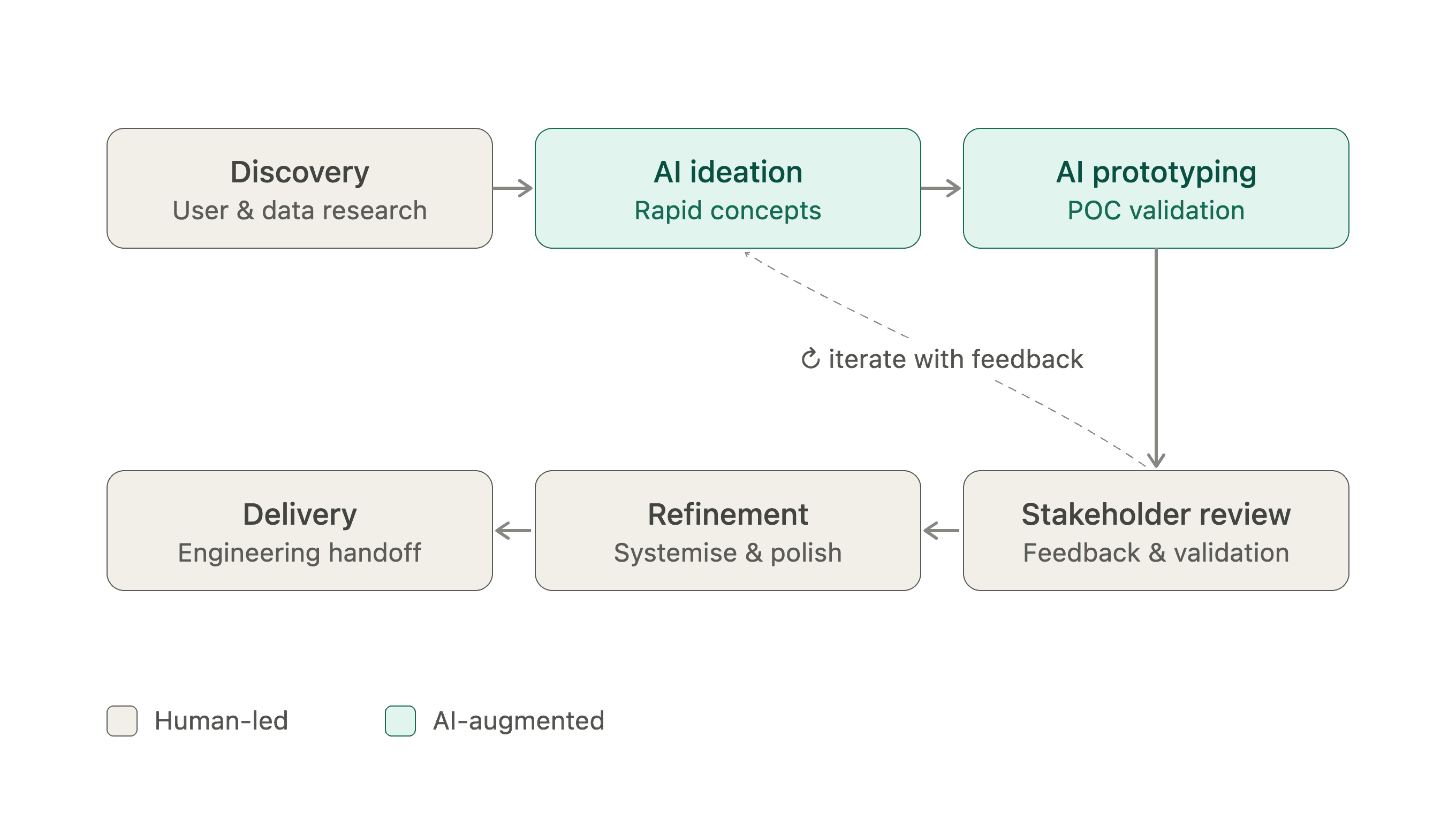
[Image: My AI-integrated design approach from discovery to initial stakeholder review]
1. Understand the current state
I began by mapping the existing end-to-end user flows against the EDRM framework, identifying every step where friction, ambiguity, or unnecessary complexity existed. This gave me a clear baseline to compare against a future-state vision.
2. Define scope with product
I led workshops with product owners to scope the MVP — aligning on which improvements would deliver the most user and business value within realistic delivery timelines.
[Placeholder image]
3. Validate feasibility with engineering
I ran sessions with engineering leaders to pressure-test the desired experience against technical constraints, ensuring designs were ambitious but buildable.
4. Ship quick wins while designing long-term
Rather than waiting for a full redesign, I identified fast, high-impact improvements that could be deployed within 1–3 months via a UI reskin and light-touch UX changes — while a longer-term POC (12–18 months) was designed in parallel. This meant engineering could continuously deploy improvements while I iterated on the bigger vision using AI-generated prototypes to test concepts with stakeholders.
Key Design Improvements
Through research and iterative design, I identified and prioritised a set of targeted improvements:
Interface & Interaction
Clean, modern visual redesign to reduce cognitive overload
Improved visual hierarchy across all screens
Voice prompts and conversational interface exploration
Clear progress indicators throughout the data-sourcing workflow
Data Selection & Flexibility
Relative date selection (e.g. "last 7 days") in addition to standard date pickers (week/month/year/recurring)
Sub-content options when selecting data sources and data types
Search by device type, custodian name, and groups/departments within a company
[Placeholder image]
Trust & Usability
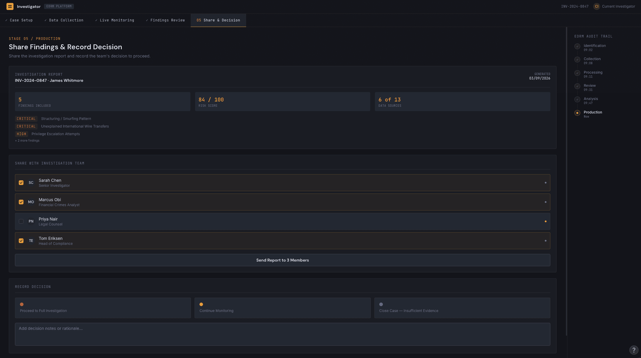
Confirmation dialogues at key decision points (previously absent)
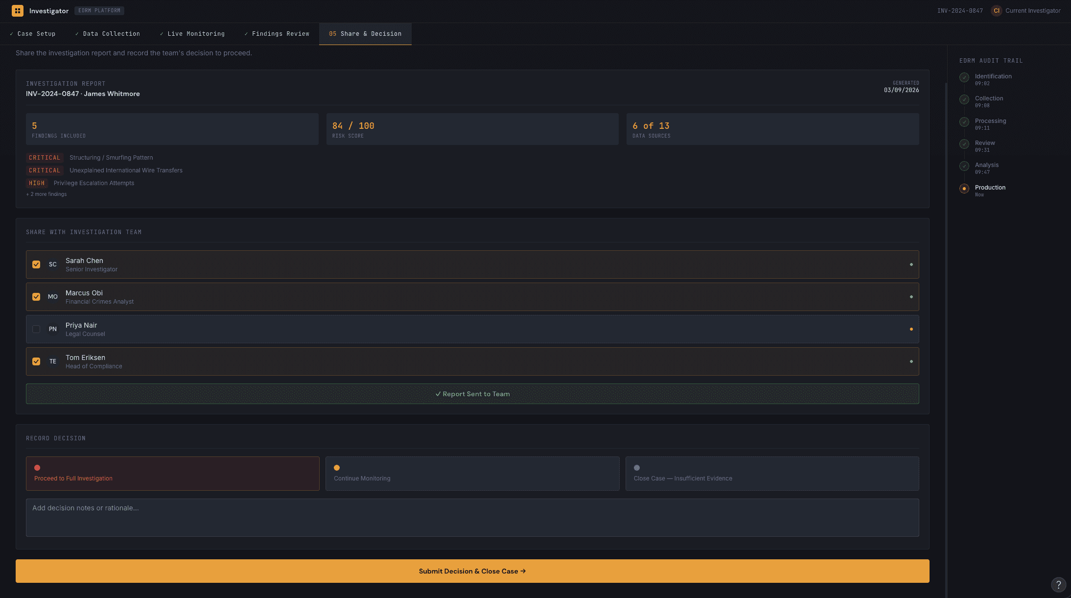
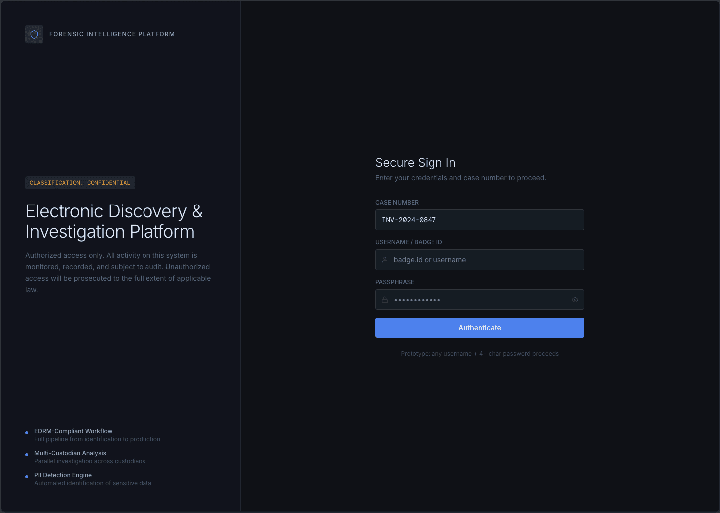
Editable summary of data collection selections before execution
Clear, actionable error messaging aligned to UX best practices
Save search enabled by default
Cloud set as the default storage option
Each improvement was chosen not just for its usability benefit, but for its downstream impact — reducing setup time, minimising costly errors, and giving users confidence in what they were about to execute.
[Placeholder image]
Getting to MVP
Once the MVP scope was finalised, I walked product and engineering leads through the latest prototype, prioritising features together to align design intent with technical delivery.
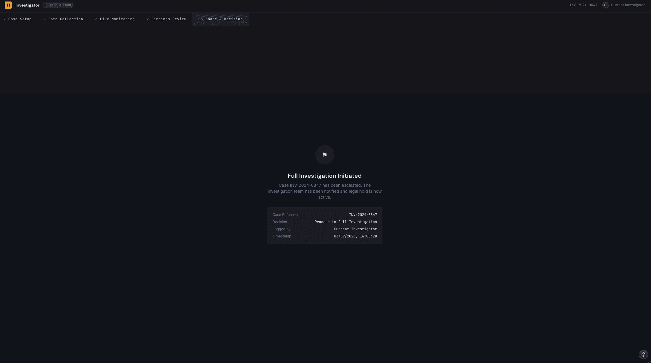
I stayed embedded through the build phase, leading QA to validate the implementation against the design — achieving 80% design-to-build fidelity. After two weeks of joint testing, the reimagined experience was deployed to an external client for initial feedback.
[Placeholder image]
Outcome & Impact
Delivered continuous, incremental value through fast-tracked UI and UX improvements while a larger transformation was validated
Directly shaped product direction through client-facing prototype testing at an industry conference
Introduced a light scan capability that reduced both user time-to-insight and operational cost
Achieved 80% design-to-build fidelity through close collaboration and hands-on QA
Shipped a validated MVP to an external client, closing the loop from current-state analysis to real-world deployment
[Placeholder image]
Reflection
This project reinforced the value of designing in parallel tracks — solving for now while building for later. Pairing quick wins with a longer-term AI-augmented vision kept engineering shipping value, kept stakeholders engaged with a compelling future-state story, and let me validate high-risk assumptions with real client feedback before committing to a full build.


