UI revamp for a rideshare mobile app and creating muli-theme branding to onboard new clients and scale quickly.
Defining the Problem
The rideshare app was originally designed and built by a team of developers who built a functional booking mobile app using existing UI component libraries. Without implementing UX design principles, it caused several problems for users:
The outdated UI was clunky and visually unappealing making it a poor booking experience for riders.
No clearly defined visual hierarchy for CTAs (call-to-action) or accessibility standards were implemented which caused frustration for impaired users wanting to pre-book a ride and pay quickly and easily.
Without a defined multi-theme branded app, the business couldn't onboard new clients quickly and acquire new clients.
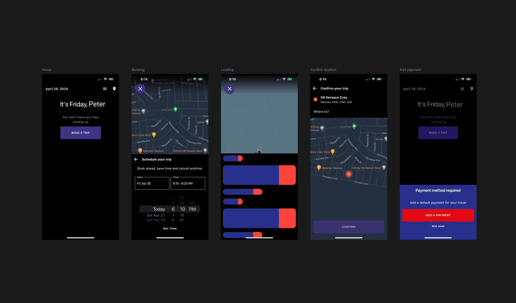
Above image: Old app screen designs (left to right) Home, Booking, Loading, Confirm location, Add a payment screen don't adhere to accessibility standards as font sizes were too small causing poor usability. Poor visual hierarchy increased the cognitive load which created many friction points in the booking process and lost opportunities for taxi organisations.
Finding a Solution
To improve the UI –
I applied UI design principles, including improving spacing so information is arranged in a clear card layout. Screens are responsive on small to large mobile devices, and icons and colours are used for functions, such as buttons.
To improve the visual hierarchy –
I defined clear primary, secondary, and tertiary-level CTAs, headings, and colour so that primary actions are clear and time spent on payment experiences is reduced, reducing friction in the journey.
Above video: Shows the Before (old home screen) and After (updated and improved) home screen.
To cater to visually impaired users –
I applied accessibility standards by increasing all font sizes, improving the colour contrast and increasing the size of the booking and payment buttons to make them more legible and easier to tap for visually impaired users.
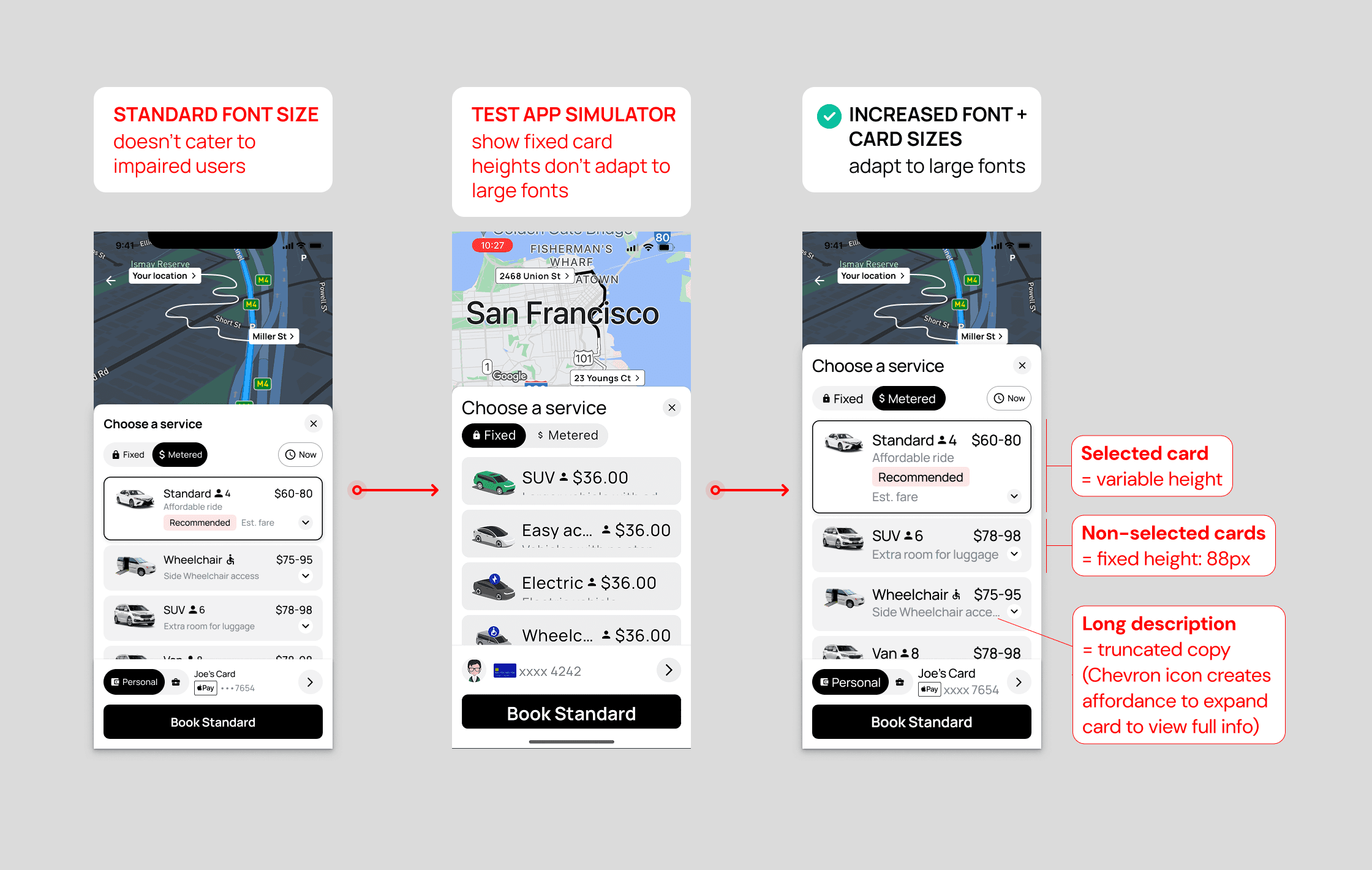
Above image: Testing revealed that the standard font I initially defined didn't cater to visually impaired users who use maximum font sizes on their device settings. To solve this, I mocked versions of key screens using larger font sizes and annotated card components to handover to developers so they could build the cards with a variable height to cater to large font size settings and ensure copy and CTA text was more legible.
To cater to the business goals –
I created a multi-theme app so they could onboard new clients and scale quickly.
Above video: I leveraged Material 3 Design Kit's themes, updated the Figma variables, applied the Material 3 Design Schemes to create a multi-theme branding that switches instantly from light, dark, light monochrome, and dark monochrome modes.
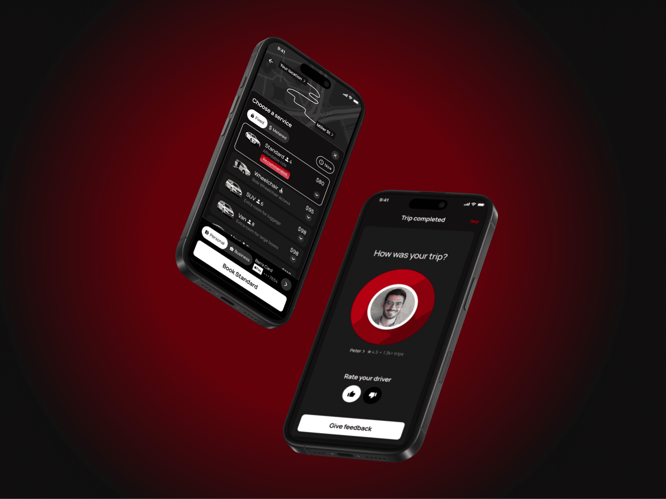
Above image: Rate Your Driver screen displayed at the end of a trip was a feature I added to allow riders to provide feedback to taxi companies if they had a positive or negative experience. This gives riders confidence and assurance to book their next trip with a highly rated driver as voted by other riders.
Results
A complete UI redesign of the entire mobile app from onboarding, booking and payment, resulted in a 100% UI uplift.
A clear and defined visual hierarchy reduced payment time by 10-20%, resulting in a 10-15% increase in income for the driver and increased revenue for the organisation.
The multi-themed, white-label app achieves the business goal of applying a new client's brand seamlessly to help organisations scale quickly and acquire new clients to increase their revenue.
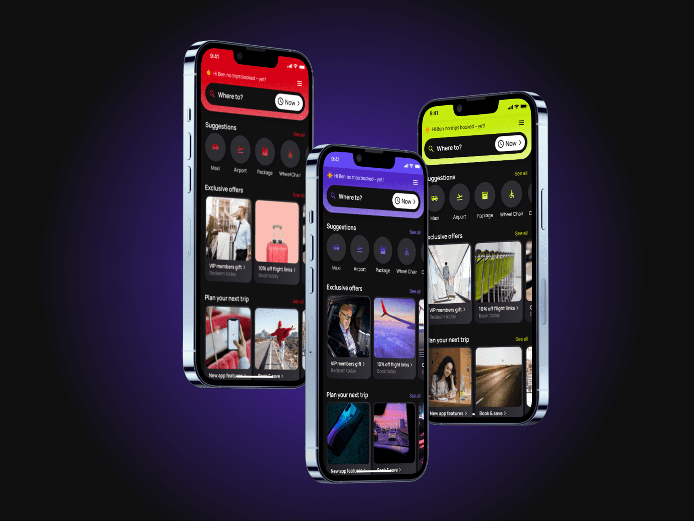
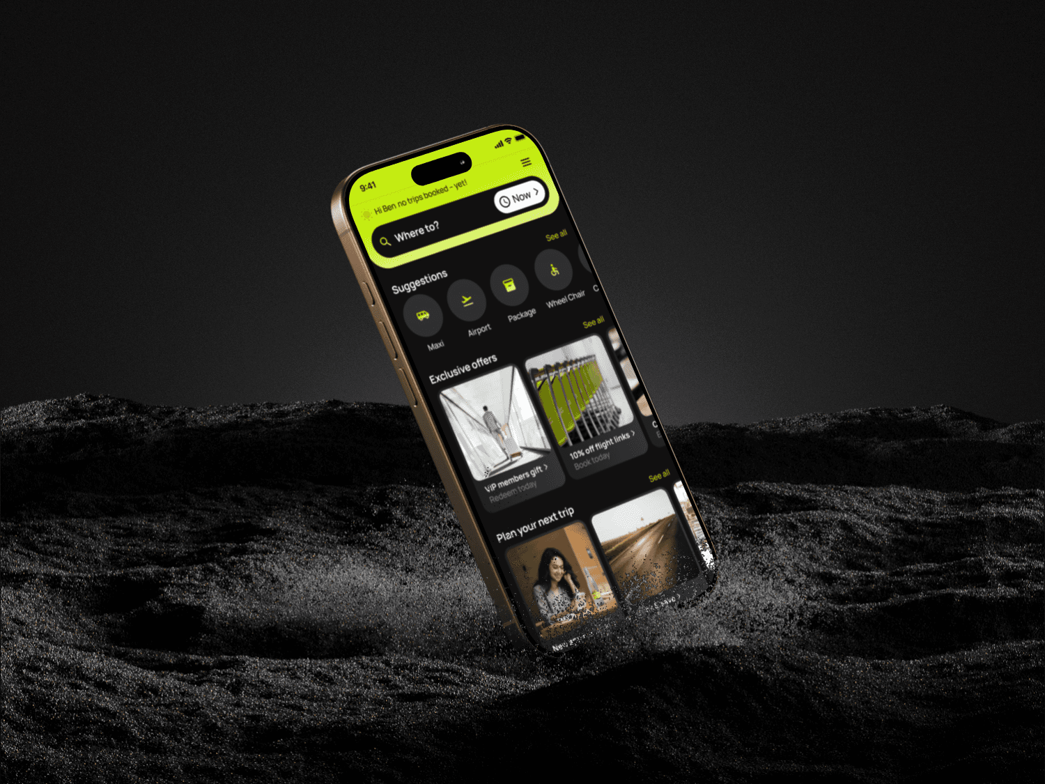
Above image: I created a white label app with multi-theme branding in dark mode, light mode (not shown) in small and large mobile sizes to enable a client's brand to be instantly applied. The speed to market reduces time and cost for clients.


