Redesigning an application process to onboard new customers easily and quickly to increase customer acquisition.

Defining the Problem
During the first few screens of the online application process, new customers experienced a cognitive load from having too many fields to complete, many of which were filled with unfamiliar stockbroking jargon. This resulted in 30% drop-offs and lost sales opportunities for the business.
More than 50% of the drop-offs caused a high volume of calls to client services and customer support teams, which struggled to keep up with daily customer queries and complaints.
Unhappy and frustrated customers abandoned the application process to open accounts with competitors who offered a more seamless onboarding experience.
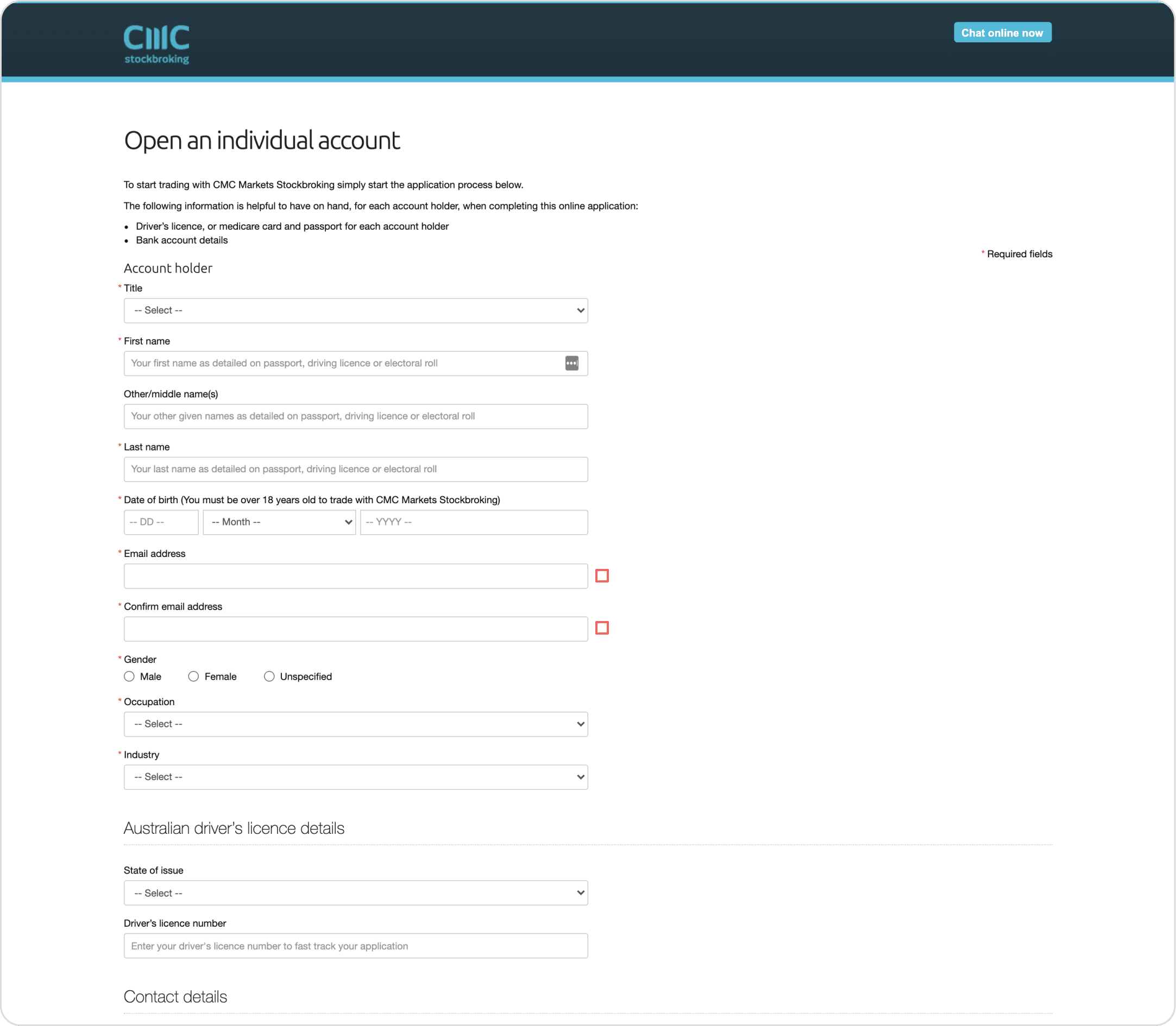
Above image: Old CMC application form displaying poor visual hierarchy and usability, inconsistent suggestion text and CTAs, not adhering to accessibility standards were just a few of the usability issues that needed to be solved to make it a more seamless experience.
Finding a Solution
Working closely with product, tech teams, legal and compliance teams, I took several approaches to streamline the application process:
To gain customer feedback and complaints –
I conducted user interviews with key stakeholders across all departments and turned insights into actionable solutions.
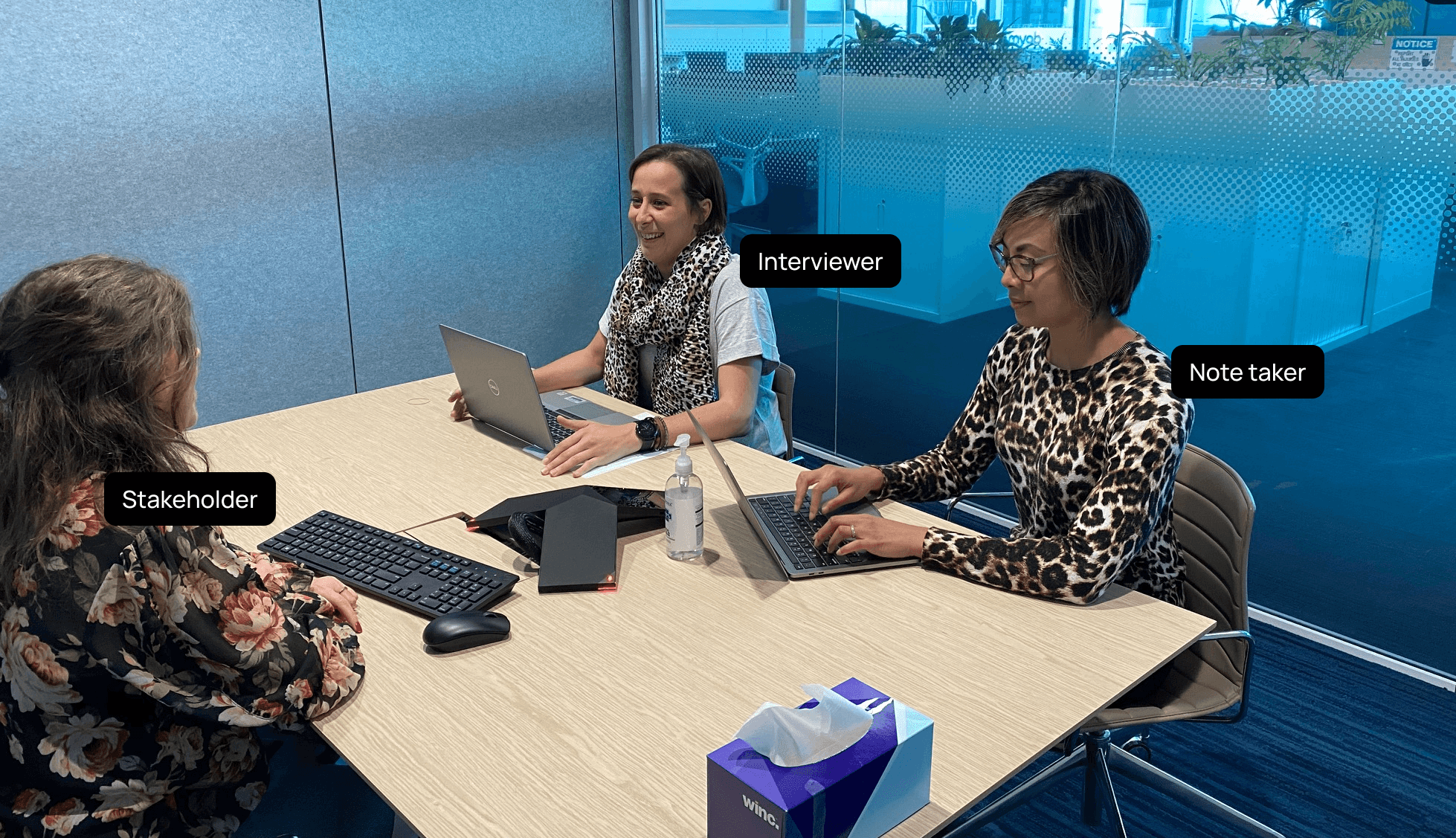
Above image: During the user interviews, I observed the participants' high level of frustration with experiencing such an outdated application process, full of friction and poor usability often spending 20-30 minutes to complete compared to a 5 minute expectation at the time (2021).
To identify pain points in the application process –
I collaborated with the product manager to create a user flow to identify all friction points if a customer doesn't have all ID documents and information ready and the time they need to spend to fix those errors until they can complete an application.
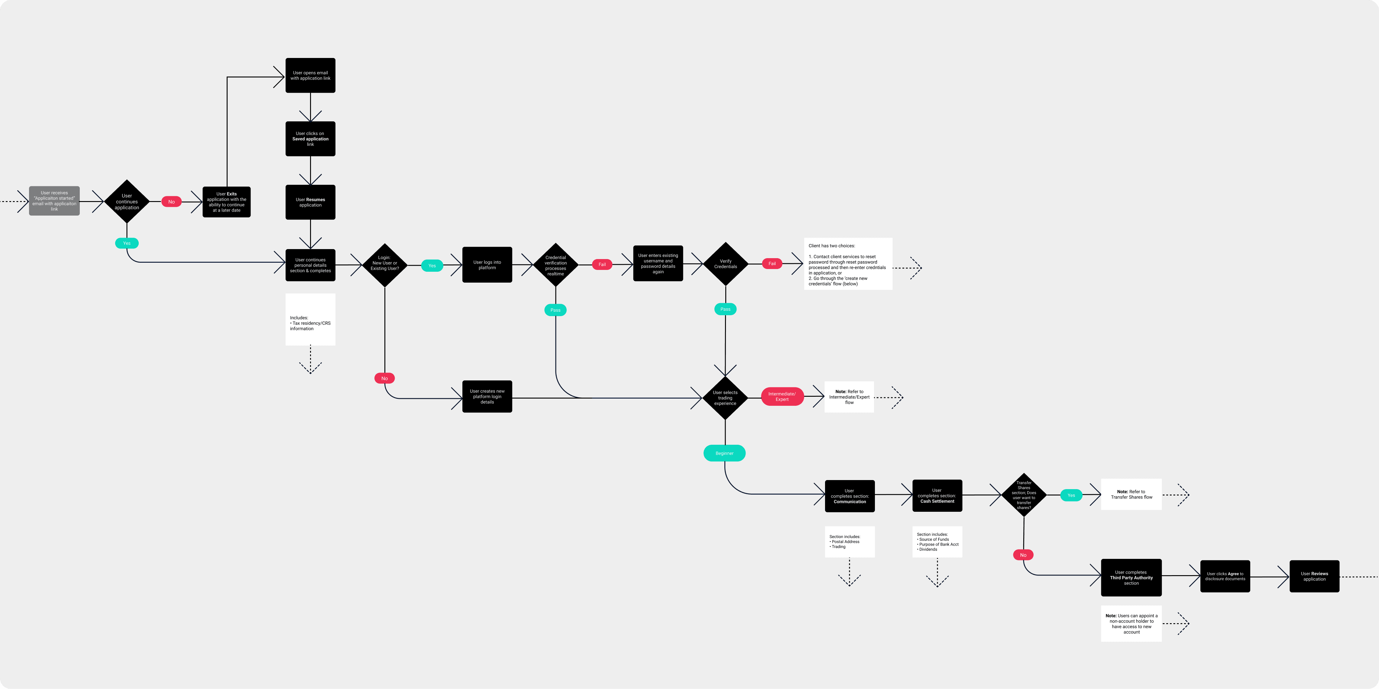
Above image: A cropped version of the entire user flow (approximately 1/3 of the journey). The white boxes indicate additional steps on top of this main flow to complete an application.
To keep all stakeholders informed along the redesign –
I mapped out all application steps against the main competitor which we used as a benchmark for continuous improvement.
Above image: Shows 10 main steps during and post application process. After step 02, the customer would've been asked to complete 18 fields. 3 main steps was identified among competitors. This cognitive load for users was identified as a pain point and critical drop-off point in the process which drove customers to seek competitors with a more seamless application process.
To identify common themes from the user interview insights –
I affinity-mapped all responses and presented them to all teams.
To reduce friction points identified in the current application –
I applied UI and UX design principles to wireframes, observed users during testing and noted recommendations for improvement to iterate further and test their improved usability.
To improve the UI design –
I conducted competitor analysis on various trading apps, tested their application process, and conducted UI research to develop UI concepts. I prototyped UI concepts based on all feedback, data and insights, led design walkthroughs with key stakeholders and noted more feedback. I further iterated the designs and completed more user testing until a seamless experience was achieved.
Above image: Exploring colour palettes for the UI concept phase similar to CMC's colour palette but is used improved visual hierarchy, brightness and contrast which adheres to accessibility standards.
To implement the developer handover –
I created a UI kit to define the colour palette, fonts, and components. I mocked all desktop and mobile screens, led developer walkthroughs, conducted testing on the front-end build and communicated UI improvements to achieve an 80% match of the Figma screen designs.
To continuously improve the experience –
I collated post-launch user feedback and further iterated the application screens ready for the next release. Below shows the iteration evolving to the final UI design:
A top progress bar was added so users are informed of their progress and feel assured as they complete the form
Grey cards were converted to static text (testing revealed the cards looked clickable)
Privacy link was an added requirement using a bright, contrasting colour (as it was missed in the original application design)
High-contrast brand colours were used to increase visibility on primary buttons to adhere to accessibility standards
Above image: Wireframe to final UI design.
Results
In collaboration with various teams across the business, we achieved a:
10-15% reduction in drop-offs within the first month of releasing the improved online application.
20% decrease in calls to customer support in the first month led to increased application approvals and acquisitions.
100% UI uplift of the app interface helped new customers trade and invest resulting in increased revenue for the business.
Above image: Final UI desktop design of the application.